This is how I programmatically plot discrete raster data (e.g. a land cover map) using Python. Here’s a Jupyter Notebook demonstrating the plotting steps using land cover data for Taita Taveta County, Kenya as an example. This dataset includes a QGIS style file (QML) which I used to configure the legend. There are probably simpler ways of doing this, so please let me know if you have any suggestions!
Data source
Abera, Temesgen Alemayheu; Vuorinne, Ilja; Munyao, Martha; Pellikka, Petri; Heiskanen, Janne (2021), “Taita Taveta County, Kenya - 2020 Land cover map and reference database”, Mendeley Data, V2, doi: 10.17632/xv24ngy2dz.2.
This data is licensed under a Creative Commons Attribution 4.0 International (CC-BY-4.0) License.
Dependencies
- cartopy
- contextily
- dask
- geopandas
- jupyterlab
- matplotlib
- matplotlib_scalebar
- numpy
- pandas
- pooch
- rioxarray
- scipy
- xarray
Importing libraries and setting up graphical parameters
Import the following libraries:
import os
import xml.etree.ElementTree as ET
from datetime import datetime, timezone
from zipfile import BadZipFile, ZipFile

import cartopy.crs as ccrs
import contextily as cx
import geopandas as gpd
import matplotlib.patches as mpatches
import matplotlib.pyplot as plt
import numpy as np
import pandas as pd
import pooch
import rioxarray as rxr
from matplotlib.colors import LinearSegmentedColormap, ListedColormap
from matplotlib_scalebar.scalebar import ScaleBar
Defining paths and downloading data
Set the basemap cache directory:
cx.set_cache_dir(os.path.join("data", "basemaps"))
os.makedirs(os.path.join("data", "basemaps"), exist_ok=True)
Define data directories:
DATA_DIR = os.path.join("data", "kenya_land_cover")
ZIP_FILE = DATA_DIR + ".zip"
Download data (which is a ZIP archive) using Pooch:
KNOWN_HASH = None
URL = (
    "https://prod-dcd-datasets-cache-zipfiles.s3.eu-west-1.amazonaws.com/"
    "xv24ngy2dz-2.zip"
)
FILE_NAME = "kenya_land_cover.zip"
SUB_DIR = os.path.join("data", "kenya_land_cover")
DATA_FILE = os.path.join(SUB_DIR, FILE_NAME)
os.makedirs(SUB_DIR, exist_ok=True)

# download data if necessary
if not os.path.isfile(os.path.join(SUB_DIR, FILE_NAME)):
    pooch.retrieve(
        url=URL, known_hash=KNOWN_HASH, fname=FILE_NAME, path=SUB_DIR
    )

    with open(
        os.path.join(SUB_DIR, f"{FILE_NAME[:-4]}.txt"), "w", encoding="utf-8"
    ) as outfile:
        outfile.write(
            f"Data downloaded on: {datetime.now(tz=timezone.utc)}\n"
            f"Download URL: {URL}"
        )
To view the list of files in the ZIP archive:
ZipFile(ZIP_FILE).namelist()
This will output the following:
['xv24ngy2dz-2/Data/Land cover map /Landcover-cMfoO1.tif',
 'xv24ngy2dz-2/Data/Land cover map /ColorCode-ni1SIo.qml',
 'xv24ngy2dz-2/Data/Land cover map /Info-UBC9RP.txt',
 'xv24ngy2dz-2/Data/Reference Database for Accuracy Assessment/File.zip',
 'xv24ngy2dz-2/Data/Reference Database for Classification/File.zip']
From this list, only the TIF and QML files will be used.
Extract the ZIP archive to DATA_DIR:
try:
    z = ZipFile(ZIP_FILE)
    z.extractall(DATA_DIR)
except BadZipFile:
    print("There were issues with the file", ZIP_FILE)
Define paths to the TIF and QML files:
for i in ZipFile(ZIP_FILE).namelist():
    if i.endswith(".tif"):
        raster_file = os.path.join(DATA_DIR, i)
    elif i.endswith(".qml"):
        style_file = os.path.join(DATA_DIR, i)
Reading the raster data
Read the land cover raster data using rioxarray1:
landcover = rxr.open_rasterio(raster_file, chunks=300, masked=True)
View the data structure:
landcover
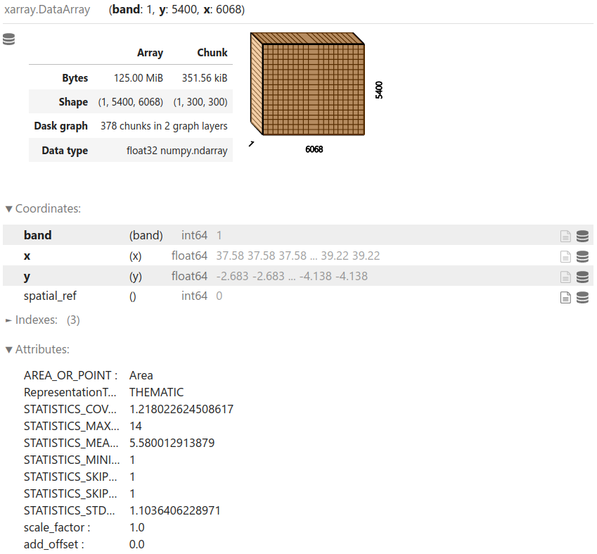
View the resolution, bounds, and CRS of the data:
landcover.rio.resolution()
# (0.00026949458520105445, -0.00026949458520105445)

landcover.rio.bounds()
# (37.583984352, -4.138089356, 39.21927749499999, -2.682818595914306)

landcover.rio.crs
# CRS.from_epsg(4326)
Processing the data
Get the unique value count for the raster data (each value represents a land cover type):
# get unique value count for the raster
uniquevals = pd.DataFrame(np.unique(landcover, return_counts=True)).transpose()

# assign column names
uniquevals.columns = ["value", "count"]

# drop row(s) with NaN
uniquevals.dropna(inplace=True)

# convert value column to string (this is required for merging later)
uniquevals["value"] = uniquevals["value"].astype(int).astype(str)

# view the unique values data frame
uniquevals
| value | count | |
|---|---|---|
| 0 | 1 | 16621.0 |
| 1 | 2 | 33046.0 |
| 2 | 3 | 33286.0 |
| 3 | 4 | 981030.0 |
| 4 | 5 | 9219689.0 |
| 5 | 6 | 7721553.0 |
| 6 | 7 | 124588.0 |
| 7 | 8 | 871990.0 |
| 8 | 9 | 75661.0 |
| 9 | 10 | 10556.0 |
| 10 | 11 | 34500.0 |
| 11 | 12 | 73355.0 |
| 12 | 13 | 89317.0 |
| 13 | 14 | 2582.0 |
Read the QGIS style file (QML) containing the legend entries and extract the colour palette:
tree = ET.parse(style_file)
root = tree.getroot()

# extract colour palette
pal = {}

for palette in root.iter("paletteEntry"):
    pal[palette.attrib["value"]] = palette.attrib

# generate data frame from palette dictionary
legend = pd.DataFrame.from_dict(pal).transpose()
legend = pd.DataFrame(legend)

# drop alpha column
legend.drop(columns="alpha", inplace=True)

# convert value column to string (this is required for merging later)
legend["value"] = legend["value"].astype(str)

# view the palette data frame
legend
| value | label | color | |
|---|---|---|---|
| 1 | 1 | Montane forest | #6ed277 |
| 2 | 2 | Plantation forest | #4d7619 |
| 3 | 3 | Riverine forest | #27f90c |
| 4 | 4 | Thicket | #fd8e07 |
| 5 | 5 | Shrubland | #fac597 |
| 6 | 6 | Grassland | #aaec85 |
| 7 | 7 | Agroforestry | #4df3ef |
| 8 | 8 | Cropland | #f9ed25 |
| 9 | 9 | Sisal | #840bfe |
| 10 | 10 | Builtup | #833023 |
| 11 | 11 | Waterbody | #3630ee |
| 12 | 12 | Wetland | #4dc4f3 |
| 13 | 13 | Baresoil | #ee15ca |
| 14 | 14 | Barerock | #132e1e |
Merge the unique values data frame with the legend and calculate percentages based on the count:
uniquevals = uniquevals.merge(legend, on="value")

# calculate percentage based on count
uniquevals["percentage"] = (
    uniquevals["count"] / uniquevals["count"].sum() * 100
)
uniquevals["percentage"] = uniquevals["percentage"].astype(int)

# sort by count
uniquevals.sort_values("count", ascending=False, inplace=True)

# view the data frame
uniquevals
| value | count | label | color | percentage | |
|---|---|---|---|---|---|
| 4 | 5 | 9219689.0 | Shrubland | #fac597 | 47 |
| 5 | 6 | 7721553.0 | Grassland | #aaec85 | 40 |
| 3 | 4 | 981030.0 | Thicket | #fd8e07 | 5 |
| 7 | 8 | 871990.0 | Cropland | #f9ed25 | 4 |
| 6 | 7 | 124588.0 | Agroforestry | #4df3ef | 0 |
| 12 | 13 | 89317.0 | Baresoil | #ee15ca | 0 |
| 8 | 9 | 75661.0 | Sisal | #840bfe | 0 |
| 11 | 12 | 73355.0 | Wetland | #4dc4f3 | 0 |
| 10 | 11 | 34500.0 | Waterbody | #3630ee | 0 |
| 2 | 3 | 33286.0 | Riverine forest | #27f90c | 0 |
| 1 | 2 | 33046.0 | Plantation forest | #4d7619 | 0 |
| 0 | 1 | 16621.0 | Montane forest | #6ed277 | 0 |
| 9 | 10 | 10556.0 | Builtup | #833023 | 0 |
| 13 | 14 | 2582.0 | Barerock | #132e1e | 0 |
Generate plots
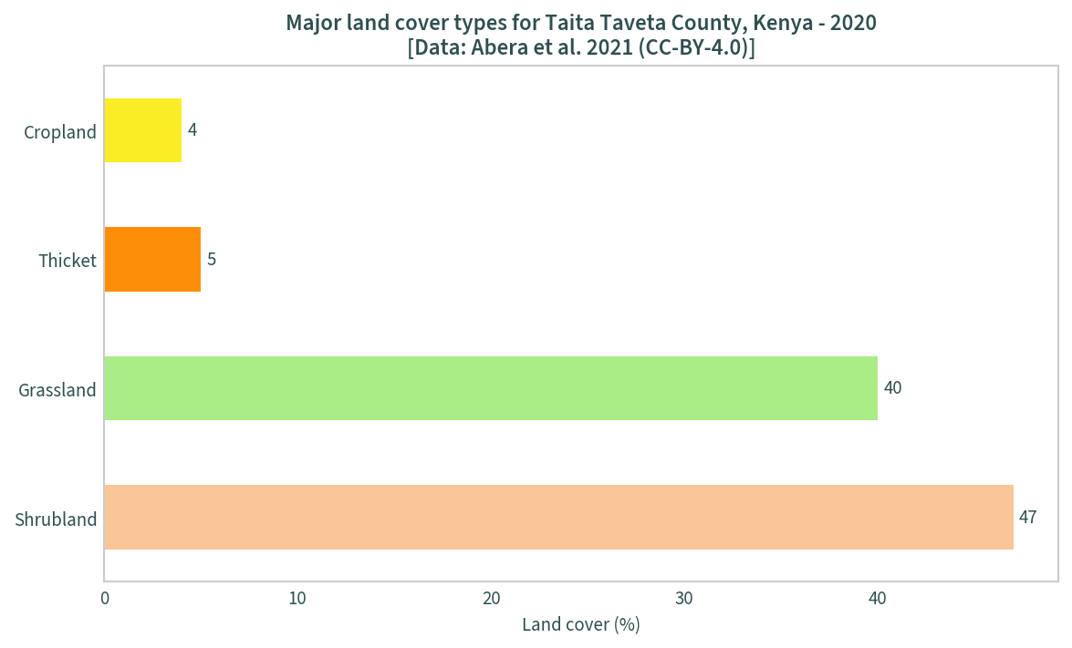
Using the unique values data frame above, a bar chart the major land cover types can be plotted:
mask = uniquevals["percentage"] > 0
uniquevals_sig = uniquevals[mask]

ax = uniquevals_sig.plot.barh(
    x="label", y="percentage", legend=False, figsize=(9, 5),
    color=uniquevals_sig["color"]
)

ax.bar_label(ax.containers[0], padding=3)
plt.title(
    "Major land cover types for Taita Taveta County, Kenya - 2020" +
    "\n[Data: Abera et al. 2021 (CC-BY-4.0)]"
)
plt.ylabel("")
plt.xlabel("Land cover (%)")
plt.show()
The next step is to create colour maps using the legend data. The unique values must be converted back to integers first:
uniquevals["value"] = uniquevals["value"].astype(int)
uniquevals.sort_values("value", inplace=True)
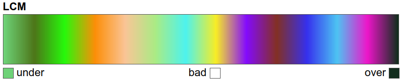
A continuous colour map is created using Matplotlib’s LinearSegmentedColormap2; this ensures each unique value has the right colour assigned based on the legend entries. The unique values are normalised from 0 to 1 using the maximum and minimum value ranges prior to creating the colour map:
colours = list(uniquevals["color"])
nodes = np.array(uniquevals["value"])

# normalisation
nodes = (nodes - min(nodes)) / (max(nodes) - min(nodes))
colours = LinearSegmentedColormap.from_list(
    "LCM", list(zip(nodes, colours))
)

# view the colour map
colours
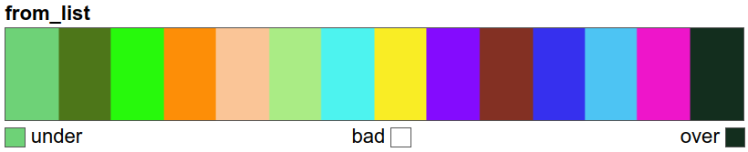
A discrete colour map is created solely for the legend in the final plot:
col_discrete = ListedColormap(list(uniquevals["color"]))

# view the colour map
col_discrete
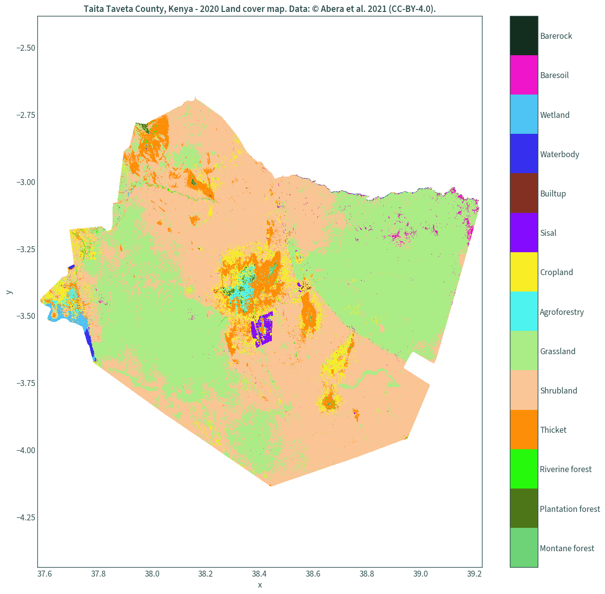
We can finally plot the land cover maps.
Map with a colour bar legend
A dummy plot must be created so that the discrete colour map is used as the legend3. This seems to be the most memory efficient way of plotting this dataset on my system.
xmin, ymin, xmax, ymax = landcover.rio.rio.bounds()

# create a dummy plot for the discrete colour map as the legend
img = plt.figure(figsize=(15, 15))
img = plt.imshow(np.array([[0, len(uniquevals)]]), cmap=col_discrete)
img.set_visible(False)

# assign the legend's tick labels
ticks = list(np.arange(.5, len(uniquevals) + .5, 1))
cbar = plt.colorbar(ticks=ticks)
cbar.ax.set_yticklabels(list(uniquevals["label"]))

landcover.plot(add_colorbar=False, cmap=colours)

plt.axis("equal")
plt.xlim(xmin - .01, xmax + .01)
plt.ylim(ymin - .01, ymax + .01)

plt.title(
    "Taita Taveta County, Kenya - 2020 Land cover map. "
    "Data: © Abera et al. 2021 (CC-BY-4.0)."
)

plt.show()
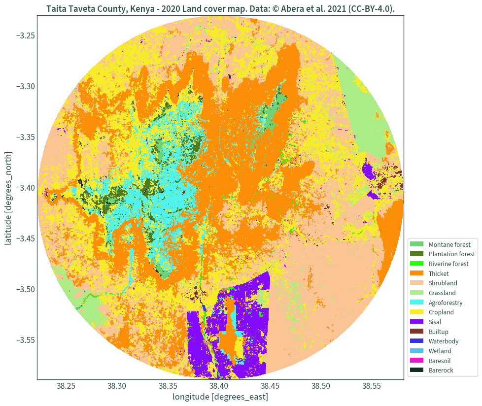
Better looking legend
For a better looking legend, legend handles are used. However, for some reason there were massive memory leaks in my system when I used the entire dataset and I haven’t quite figured out what’s causing it. So, for this demonstration, a circular subset of the dataset is used, taken as a 20 km buffer from the centre point of the data’s bounds. The Web Mercator projection is used for handling the buffer.
CRS = 3857  # Web Mercator projection

# 20 km buffer at the centre
mask = gpd.GeoSeries(
    gpd.points_from_xy(
        [xmin + (xmax - xmin) / 2], [ymin + (ymax - ymin) / 2],
        crs=landcover.rio.crs
    ).to_crs(CRS).buffer(20000).to_crs(landcover.rio.crs)
)
Check the mask:
mask.total_bounds
# array([38.22196787, -3.58978183, 38.58129398, -3.23109267])
Clip the land cover data using the mask and plot:
fig, ax = plt.subplots(figsize=(10, 10))
landcover.rio.clip(mask).plot(add_colorbar=False, cmap=colours, ax=ax)

legend_handles = []
for color, label in zip(list(uniquevals["color"]), list(uniquevals["label"])):
    legend_handles.append(mpatches.Patch(facecolor=color, label=label))

ax.legend(
    handles=legend_handles, loc="lower right", bbox_to_anchor=(1.21, 0)
)

plt.title(
    "Taita Taveta County, Kenya - 2020 Land cover map. "
    "Data: © Abera et al. 2021 (CC-BY-4.0)."
)

plt.show()
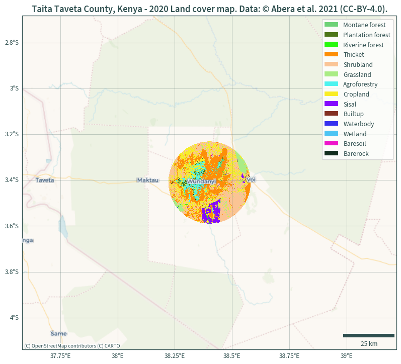
Adding basemap, gridlines, and scale bar
The following plot uses the same masked data and additionally includes a basemap, a scale bar, and gridlines. Since the basemaps are in Web Mercator projection, the data is reprojected to match this (alternatively, the basemap can be reprojected to match the data instead).
xmin, ymin, xmax, ymax = landcover.rio.reproject(CRS).rio.bounds()

plt.figure(figsize=(10, 10))
ax = plt.axes(projection=ccrs.epsg(CRS))
landcover.rio.clip(mask).rio.reproject(CRS).plot(
    add_colorbar=False, cmap=colours, ax=ax
)

plt.ylim(ymin, ymax)
plt.xlim(xmin, xmax)

cx.add_basemap(ax, source=cx.providers.CartoDB.VoyagerNoLabels)
cx.add_basemap(ax, source=cx.providers.CartoDB.VoyagerOnlyLabels)

legend_handles = []
for color, label in zip(list(uniquevals["color"]), list(uniquevals["label"])):
    legend_handles.append(mpatches.Patch(facecolor=color, label=label))

ax.legend(handles=legend_handles)

ax.gridlines(
    draw_labels={"bottom": "x", "left": "y"}, alpha=.25, color="darkslategrey"
)

ax.add_artist(
    ScaleBar(1, box_alpha=0, location="lower right", color="darkslategrey")
)

plt.title(
    "Taita Taveta County, Kenya - 2020 Land cover map. "
    "Data: © Abera et al. 2021 (CC-BY-4.0)."
)

plt.show()